Project Overview
Goal
This project analyzes survey data from data professionals worldwide to understand salary distributions, programming language preferences, and job satisfaction drivers, enabling better talent management and strategic workforce planning.
Download from GitHub!Background Information
This dataset consists of comprehensive survey responses from data professionals worldwide. It includes key demographic information, including age, gender, country of residence, and education level. Professional details include job role, industry sector, salary range, and career transition experience. The survey also measures job satisfaction across dimensions such as compensation, work-life balance, management quality, and learning opportunities. Additionally, the survey captures technical preferences, including programming languages, and insights into career mobility challenges and priorities in job searches.
Setup
This project began with comprehensive data cleaning in Power BI, removing duplicates, and data type standardization. Because the salary data was in range format (e.g., "0-40K," "41K-65K"), I created a DAX calculation to convert these ranges to numeric averages for quantitative analysis. Using Power Query, I split the columns and applied additional DAX measures to enhance analytical capabilities. Data validation ensured there were no missing values, providing a solid foundation for visualization and insights.
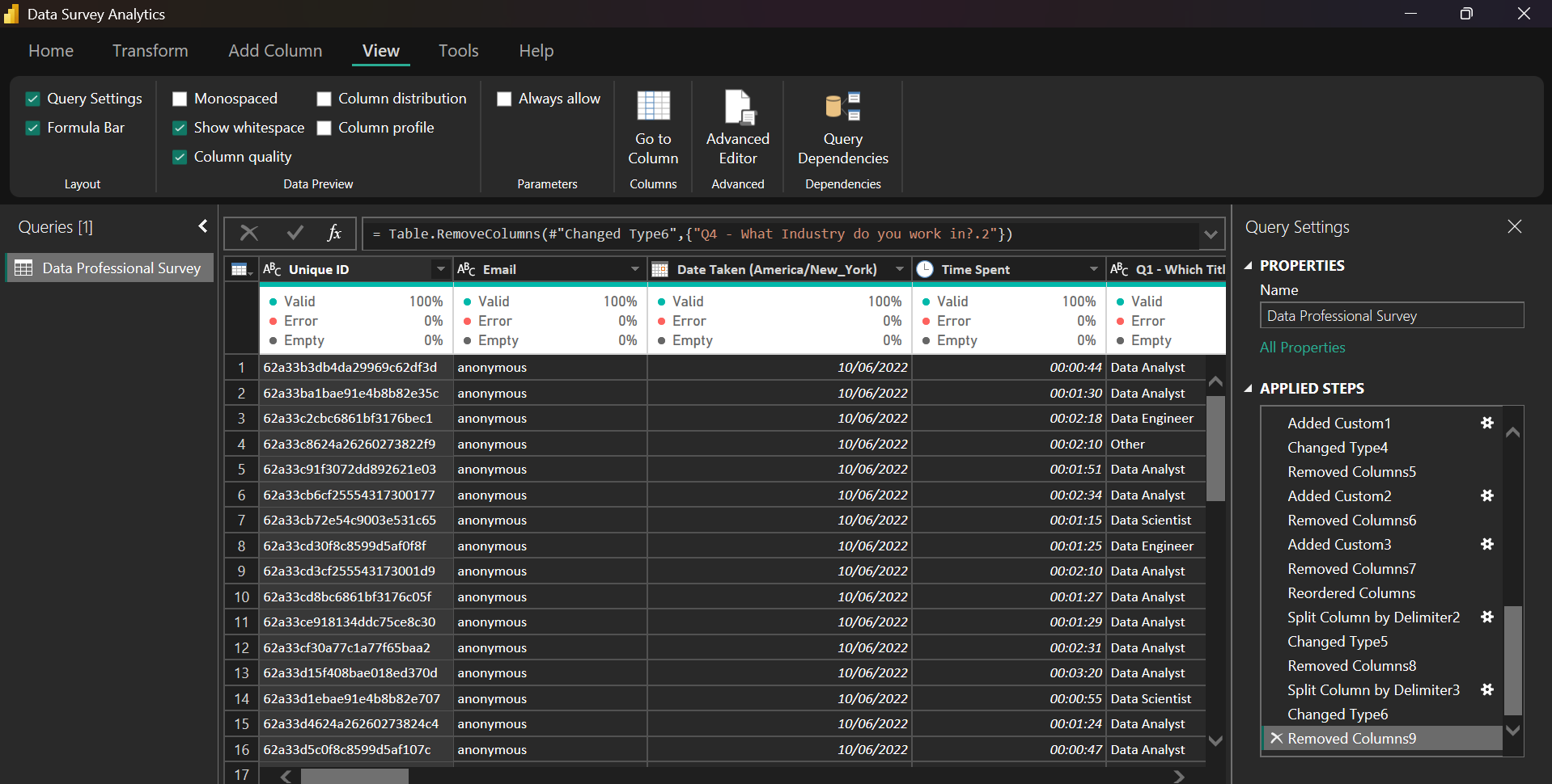
Fig 1. This image shows the dataset after it was loaded.
These steps are important to ensure that the data is formatted correctly for analysis and will produce accurate results.
Dashboard Design and Creation.
Using processed data, I created a comprehensive Data Professional Survey Dashboard that provides key insights into the data industry workforce. The dashboard includes visualizations showing demographic distribution across countries, salary patterns by job title and gender, and levels of satisfaction with work/life balance and compensation. These insights provide valuable perspectives on current industry trends, compensation benchmarks, and the drivers of job satisfaction among data professionals worldwide, helping organizations make informed decisions about talent acquisition and retention strategies.
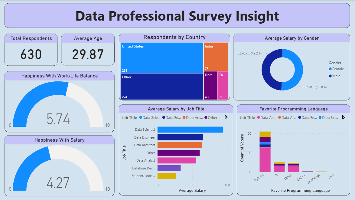
Fig 2. This image shows the Data Survey Dashboard.
In addition to the core visualizations, I enhanced the Data Professional Survey Dashboard with interactive slicers. These slicers allow users to dynamically filter data based on key criteria like Country, Job Title, and Gender. This interactivity allows for more granular data exploration, allowing users to uncover specific insights—such as Data Scientist salary trends in specific countries or satisfaction levels across various roles—for a more personalized and in-depth analytical experience.
Conclusion
The Data Professional Survey Dashboard created in Power BI serves as a powerful tool for understanding global data industry trends. It effectively demonstrates my skills in data transformation, analysis, and visualization. The competencies gained from this project—including processing complex survey data and creating interactive analytics—are highly transferable, enabling me to deliver data-driven insights across various sectors to support strategic talent and business decisions.